PnP IconPicker control in SPFx
PnP initiative is awesome because, among many other things like sample codes, guidance documentation, community calls. it has also provided some reusable controls which can be used in SPFx web parts and extension. You can refer to this link for details.
There are 2 types of controls SPFx react controls that can be used in the content of the web part and other SPFx property pane controls which can be used in the property pane of SPFx web part.
Yesterday, SPFx react control Version 1.17.0 was released which added 4 new controls and other enhancements and bug fixes. You can find a summary of current release at this link
In this article, we will learn how to use PnP Icon Picker control in the SPFx web part. This control will allow us to search and selects an icon from office-ui-fabric-react icons.
Create WebPart
Run below commands in sequence.
Open a command prompt and create a directory for SPFx solution and go to that directory.
md PnPControlsDemo
cd PnPControlsDemo
Let us now create our solution
yo @microsoft/sharepoint
Select below options

Once you select all options in wizard one by one, it will take some time to generate the code structure.

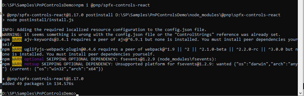
Now let us install required npm packages to use PnP controls. Run below command
npm install @pnp/spfx-controls-react --save
After it is completed, open the same folder in Visual Studio code( you can use any other editor also).
Now let us modify code to use these controls.
Step – Passing WebPart context to React components
Combobox List Item Picker requires Sharepoint site context to work with, hence we will pass it from our web part file to react components.
Open src\webparts\controls\components\IControlsProps.ts
Modify code to below
import { WebPartContext } from '@microsoft/sp-webpart-base';
export interface IControlsProps {
  description: string;
  context: WebPartContext;
}
Open src\webparts\controls\ControlsWebPart.ts
Modify render method to pass context.
public render(): void {
   const element: React.ReactElement<IControlsProps > = React.createElement(
     Controls,
     {
       description: this.properties.description,
       context:this.context
     }
   );
   ReactDom.render(element, this.domElement);
 }
Please note we have just added line ‘context:this.context’ .
Step – Modify React component associated with web part.
Open src\webparts\controls\components\Controls.tsx
Import the Icon Picker Control
import { IconPicker } from '@pnp/spfx-controls-react/lib/IconPicker';Step – Add state property to hold selection icon
Create Interface to Store State, add below code below last import statement
export interface IControlsState {
  icon:any;
}
Modify component class as below
export default class Controls extends React.Component<IControlsProps, IControlsState> {
  constructor(props: IControlsProps, state: IControlsState) {
    super(props);
    this.state = {icon: ""};
  }
public render(): React.ReactElement<IControlsProps> {
....
....
....
Modify render method
public render(): React.ReactElement<IControlsProps> {
    return (
      <div className={ styles.controls }>
        <div className={ styles.container }>
          <div className={ styles.row }>
            <div className={ styles.column }>
              <span className={ styles.title }>Welcome to SharePoint!</span>
              <p className={ styles.subTitle }>Customize SharePoint experiences using Web Parts.</p>
              <p className={ styles.description }>{escape(this.props.description)}</p>
              <a href="https://aka.ms/spfx" className={ styles.button }>
                <span className={ styles.label }>Learn more</span>
              </a>
            </div>
          </div>
        </div>

        <br>
        </br>
        <br></br>

        <IconPicker buttonLabel={'Select Office UI Fabric Icon'}
            onChange={(iconName: string) => { this.setState({icon: iconName}); }}
            onSave={(iconName: string) => { this.setState({icon: iconName}); }} />
        <br></br>
        Selected Icon is:
        <br></br>
        <Icon style={{fontSize:'24px'}} iconName={this.state.icon} className="ms-IconExample" />
      </div>
    );


  }
So if you look at above code, what we are doing is.
- Added IconPicker control
- On selection of icon from Icon picker control, set the state of selected icon name.
- Display this icon by using Icon control of Office UI fabric and setting the iconName property from state object.
For now, let us see this web part in action. Run gulp serve
gulp serve
Open workbench in context of any SharePoint online site.
https://spevents.com/sites/spsahmd2019/_layouts/15/workbench.aspx
On Page load.

Click on Select Office UI Fabric Icon.

On selecting Icon and click save.
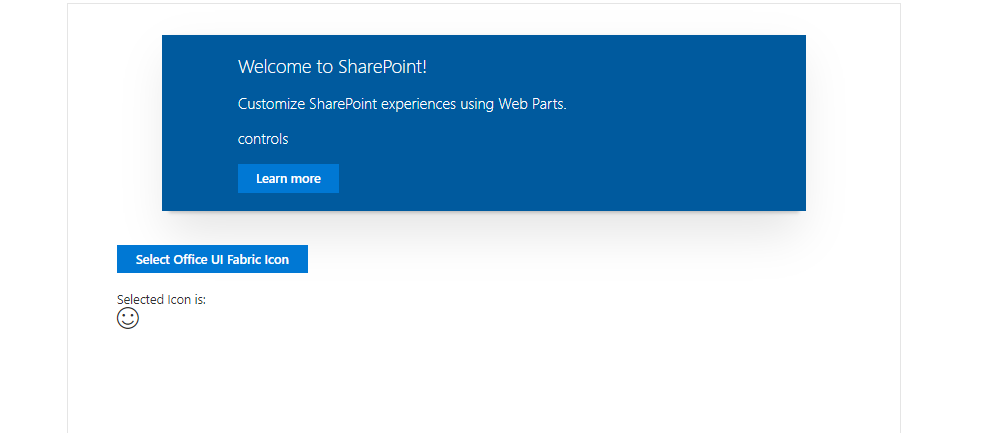
Conclusion – This control can be very useful when we want to provide the end-user capability of selecting icons and using them for the user interface.
Thanks for reading, hope you enjoyed it.

 Users Today : 242
 Users Yesterday : 234
 This Month : 6069
 This Year : 45048
 Total Users : 475376
 Views Today : 810
 Total views : 1085964