Component in PowerApps
In this article, we will learn about the concept of Component in PowerApps and how we can reuse it in other App. Let’s consider a requirement where we need to display a header and footer in our App and suppose we will be having more than 10 screens.
So in this case, if we are not using Components then it will be difficult to keep that header and footer on every screen and if there is any change let’s say for font size or Title or logo, we need to navigate all 10 screens and make those changes there. To avoid these repetitive changes Components can be used.
Components are reusable building blocks available in PowerApps. Using component App maker can reuse it in the same App or across App using the component library. The component library is nothing just play the role of a container that will contain all components in it.
Let’s see an example for how the component works,
Step – Open PowerApps > Create Canvas App

Step – Select Component > Create New Component

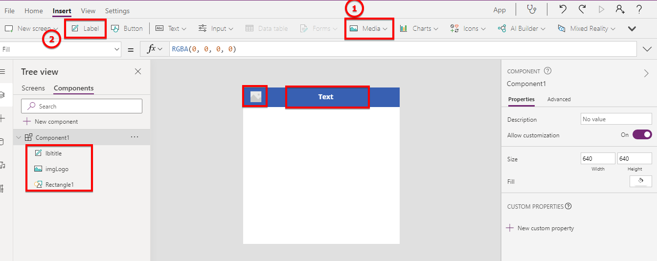
Step – After the component is added, Click on Insert in menu > select icon and add Rectangle after scrolling in the icon menu

Step- Now Add an image and label control above rectangle added above

Step – Now create 2 custom properties from the Right panel

Step – Add New property with Data Type Text to set Header Title

Step – Same way Add other property with Data Type Image to set logo

Step – Now select image control, from property select Image property and set it to <component name>.<property name>

Step – Same needs to be done for the Title label

Step – Set Height of Component to the required height

Step – Go to Screen > Add Component to your screen

Step – After Adding Component to Screen, Add logo as per need to media section in the left panel

Step – Now set added a logo to Component Property,

Step – Like logo, Set Title property of Component

This way you can design header components, We can add any styles, font size, color, or anything else that we want to make our component look better.
In the same way, we can also create a footer component
Step – Create another component named FooterComponent > You can rename it from three dots menu after component name as shown below,

Step – Add Html Text control from Text Menu

Step – Now Add this component on Screen,

Step – Set Y property of Footer Component as dynamic

So now the overall component is as above.
We can add as many custom properties as we want that need to be set from our screen to make content dynamic in components.
So in this way, we can create a reusable component that can be used in all screens in the current App and also can be used in Other Apps as well.

